
Optimizing navigation for book formats
Overview
Audible gets a lot of its traffic from customers that land on a book page (usually Kindle) and click on the Audible format option in the center of the page - about 6 Million a month.

Across all kinds of opportunites and initiatives, the primary goal for any product team at Audible is increase their membership acquisition. This is a case where I discovered a great opportunity for Audible to reach more users on Amazon and lead the discussions and subsequent product changes across different Amazon book teams.
Role
UX Design
Team
PM, Engineering,
Amazon, & Audible stakeholders
Timeline
Q2 2017 • Research & Design
Q3 2017 • Alignment
Q4 2017 • Launch
Opportunity for Audible
100MM
Monthly views on multi-format books
40%
Browsers did not display Audible format
90px
Design needed to fix
$20MM
Additional annualized revenue if fixed
Discovery
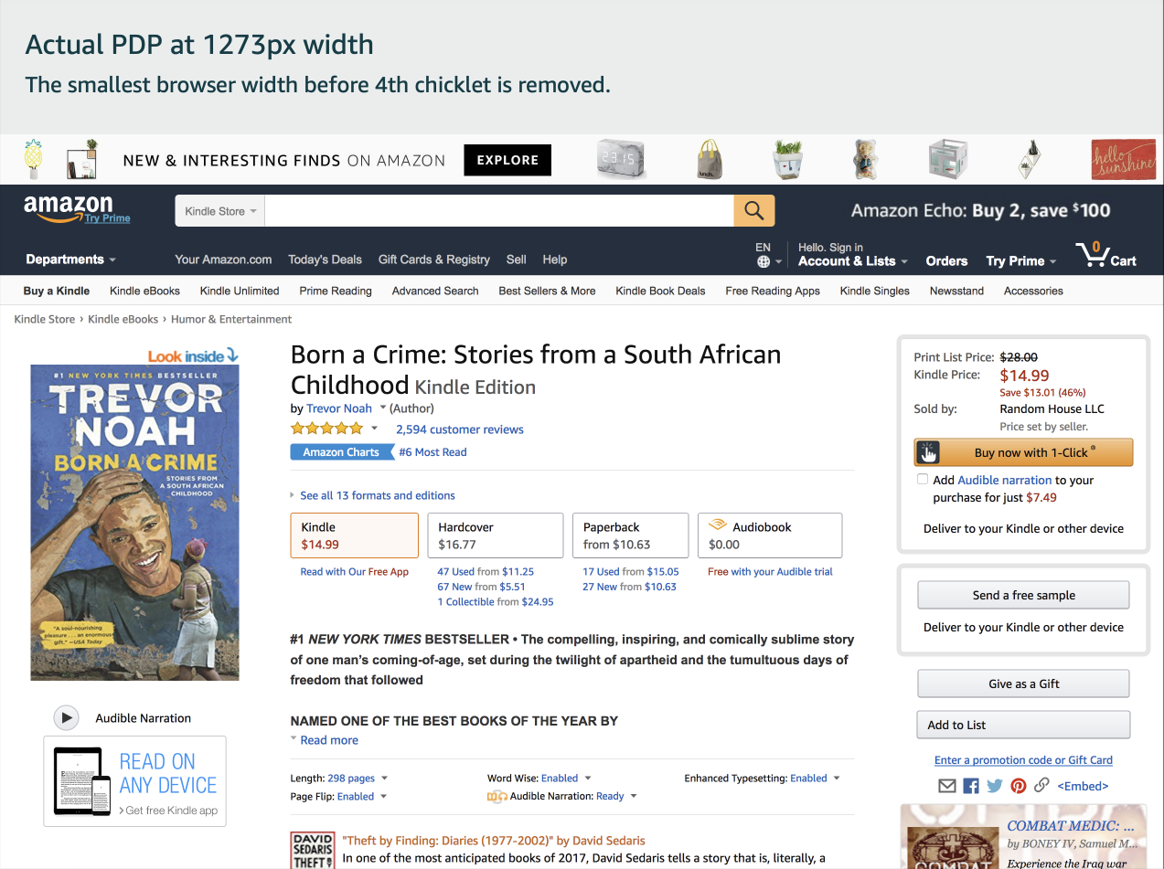
The Audible web team typically designed on a 1280px template for Desktop, but while I was live-testing one my designs, I noticed that our audiobook format option was disappearing from the book page at smaller sizes!
This menu for book formats was built to completely hide formats that don't fit within the center column of the page. Audible was also the 4th button in the list of options. Seemingly no one else working on books at Amazon had noticed this, with a design template of 1280px wide.

I wanted to understand how many users were impacted before bringing this to my product manager, and found it was about 36% of users were looking at books with a browser smaller than 1250px, where Audible was not visible.
Defining the business opportunity
Audible generates the greatest revenue for Amazon out of all of its book formats, and the second greatest in recurring revenue after Amazon Prime.
I framed this as an opportunity for Audible and Amazon alike. I brought up this issue and the browser data to my product manager who helped identify the financial impact, which was significant.

There had been 100 Million monthly “glance views” to Kindle, Paperback, and Hardcover books for which there are at 4 or more formats. Estimating that 40% of customers were not seeing the 4th format button for Audible on book pages translates to approximately 40 Million monthly views missed. So when my PM applied the current click-through rate, she noted Audible was missing about 600,000 visits a month.
Advocating customer goals
I also made it clear that beyond the obvious business opportunity, there were several basic user needs that aren't being met:
• Able to see what options are available for buying this book.
• Get the Audible version of this book.
• Know I’m getting the best deal.
Reducing this menu width to ensure Audible is shown to all desktop customers was estimated to generate ~$20,700,000 in annualized downstream impact.
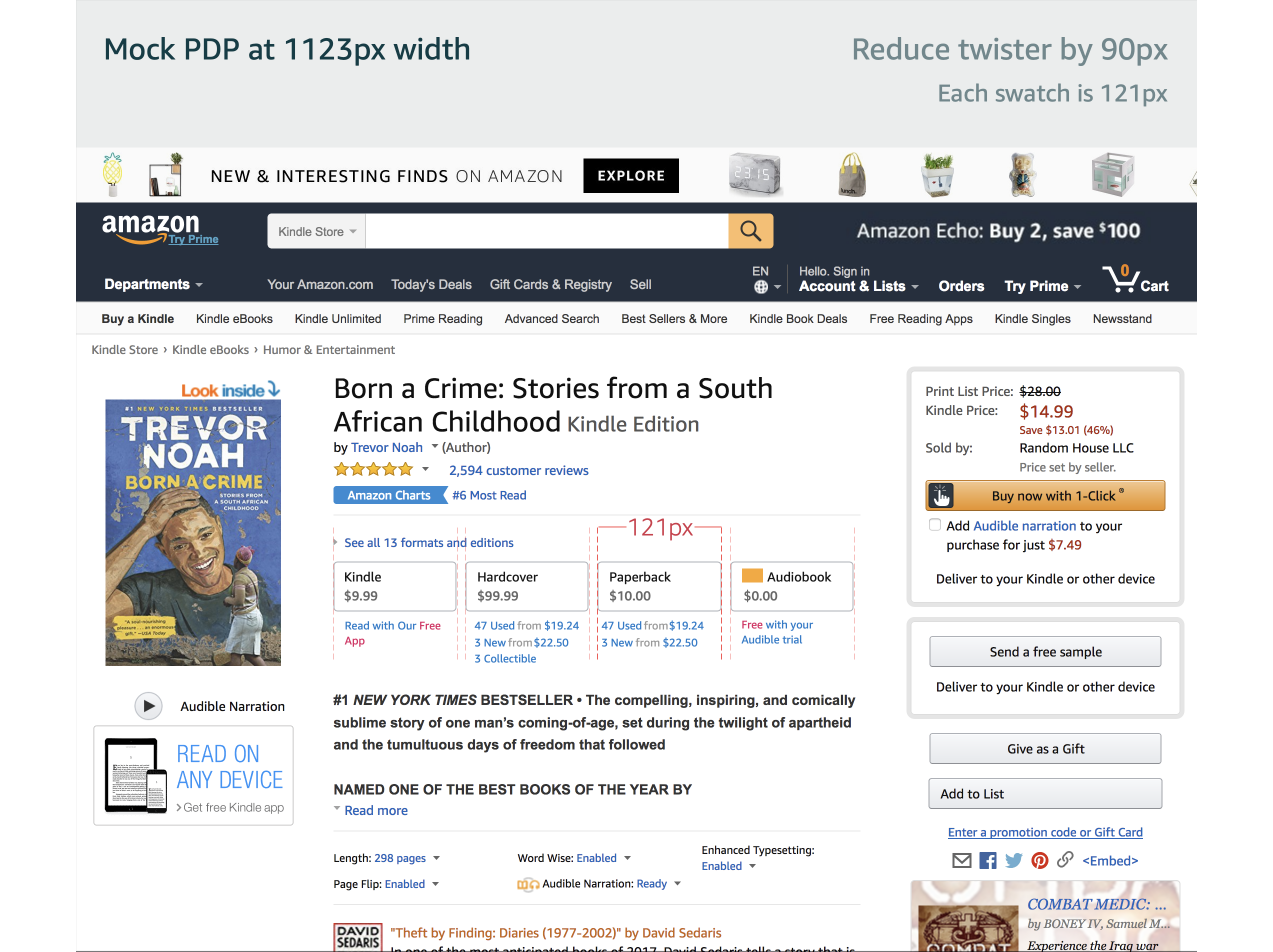
Design
I rebuilt the detail page at various sizes to illustrate the impact of potential solutions to all stakeholders. Here is an example of the optimal compromize, understanding that the most dramatic changes could negatively impact other media types:
Cross-Amazon alignment
Most projects on my team stay within our own Audible domain. This project was unique, because it gave me exposure to other design leaders at Amazon.
I presented recommendations to Amazon UX and PMs from Kindle, Books, and Media Matrix teams. Everyone had agreed that this is good for the customer, and many hadn’t even noticed it was an issue until now.
Small change, huge results
30%⬆
Glance views increased
13%⬆
Click-through rate increased
4.6%⬆
Audible membership acquisition
Launch
The only design change that could be quickly agreed upon was to set all button sizes to a smaller width, so there wasn’t any additional documentation to provide apart from the measurements I already illustrated for our discussions.
There was a technical constraint that meant each button could not be fixed to a certain size (e.g. 109px), but a compromise was to remove extra padding when possible.
As a designer, I think this navigation could look much better, and future projects will address that, but as you can see above, even the present update was a huge success with my initiative driving a 4.6% increase in membership acquisition.